
.
For those of you you who didn’t read the Guardian article on book covers, it said booksellers (who sometimes influence publishers in their choice of cover) think that generic mass-market-appeal covers outsell more offbeat covers or striking covers (and this is not just for sf/f books either). The article indicated that what matters is not the actual accuracy of a cover re the story within, but rather that it implies the general type of story – even when it may be quite inaccurate as to theme and atmosphere.
Remember, the question was: which cover would make you pick up the book with a view to buying? In other words, which cover piques that initial interest… The Guardian article suggests that browsers spend a mere .8 of a second glancing at the cover.
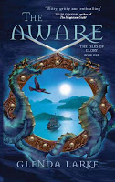
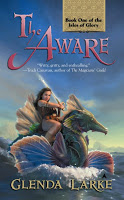
And the runaway winner is: Harper Voyager Australia! With artwork by Greg Bridges, design by Gayna Murphy, the cover won an industry award. 61% of you would pick up this book.
The cover is quite truthful: the book is a peek at an island world, there are ships and a bird is important. There is swordplay and sea creatures. In fact the porthole effect is a clever comment on the framing of the story – an outsider, an ethnographer, comes to record the life story of a swordswoman. He’s a bit of a biased fellow and sees everything through his rigid point of view and completely misses the thrust of much of her tale.
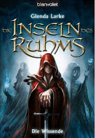 Second was the German cover from Blanvalet. I don’t yet know who the artist is, as I have not yet received the actual book.
Very generic indeed. Lovely design and colour and atmosphere to it, but doesn’t tell you much about the story except that swords and magic is involved. There is no magical staff in the book. And I don’t think there were any cloaks either, but cloaks are very much the in-thing at the moment. It’s not clear if the central figure is a man or a woman.
39% of you would pick this one up. (Remember that those taking part in the poll had the option of picking up more than one title.)
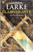 Only a little way behind the German translation above, was this French translation from Pygmalion.36% of you would pick this one up.
Also generic, but it captures more of the essence of the story than the German cover. The heroine does carry a very special sword. The reflection on the sword shows islands and ships, and the background is a manuscript – the scientific reports of the ethnographer, perhaps.
The artist was Alain Brion.
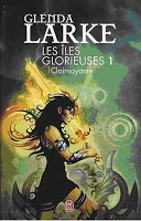
Next is another French cover, from J’ai Lu, a little retro in design. The artist is Arnaud Cremet.
15% of you would pick this one up. It is the first to definitely have a go at portraying the main character, Blaze Halfbreed, who is a brown-skinned islander swordswoman. I did not envision her dressed this way, though…
The background shows a map of an island and navigational aids.
Then comes the U.S. Ace (Penguin) with this representation of Blaze by Scott Grimando and design by Annette Fiore. 5% of you would pick this one up. And every single review it garnered complained that the cover was at complete odds with the feel of the story. Yes, there was a sea creature that could be ridden, but there was something about the half-clad woman in that pose that really rubbed readers up the wrong way.
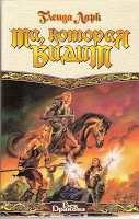 And last, the Russian cover. I can’t tell you the artist because I can’t read the cyrillic lettering. Very generic, does show the importance of swords and magic in this story, and there was an elderly man who died.
A bit ironic though, seeing as one of my aims with The Aware was to tell a story that had NONE of the usual tropes apart from swords: no horses and no quests/journeys being at the top of the list. The whole book is set on a small treeless island with one town. There were no pterodactyls, either. Or armour.
This cover didn’t do too well with you all, even though it is arguably the most generic of all. It garnered one vote.
The limitations of the poll? There were only 63 people replying, and probably a majority were influenced by having read the book first. Still, it’s interesting to see what intrigued most.
Thank you for replying!
.
Ilove that Aussie cover, yet normally I don't go for covers that don't at least attept to depict a character. Nevertheless, this one really grabs me. The porthole effect is very clever.
One reservation about the depiction of characters: there's nothing worse than seeing a blue-eyed blonde in what's supposed to be battle dress but which actually leaves her almost completely exposed. It puts me off a book, yet so often the description of the character and her accoutrements within the book are quite different from the cover!
Another aspect of the voting – I did pick it up initially because of the cover (I bought it for other reasons). But I only had one to choose from when I was buying it, and I have no idea whether I was looking at other books at the time. So I'm already familiar with the cover, so I'm biased to vote for it.
That's very true, if that is the only cover you ever saw other than online, it does give you a bias towards it. It appears that Australian covers seem to reflect the essence of a story more than anywhere else. I cannot imagine anyone who fights with a sword running around half naked, no protection from your adversary.
I haven't read the book but I did like the Australian cover(I suppose Voyager know their audience). The first German cover I also liked both for its good use of red-just enough to stand out from the background, but not too bright-and the idividually styled font really attracted me.
The French cover was too yellow, and the second German cover made me think of 70s pulps-it might be retro and then again it may have just been on the shelves for a really long time. The US cover, well, pastels, pink and prominant uncovered thigh-yuck! How do US fantasy covers always manage to be so awful? The Russian cover I found to be just too busy-don't forget the KISS principle!
Those are the ones I picked. 🙂 They are all great covers though, I do have to say. Always interesting to see how a cover influences the eye to pick up a book.
Thanks for the interesting comments, everyone! I guess in the end, it's all about individual choice, and the publisher has to go for what they think has the widest appeal.
The irony of that is that once again it boils down to a couple of people making a decision about that they think has the widest appeal!!