
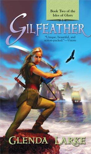

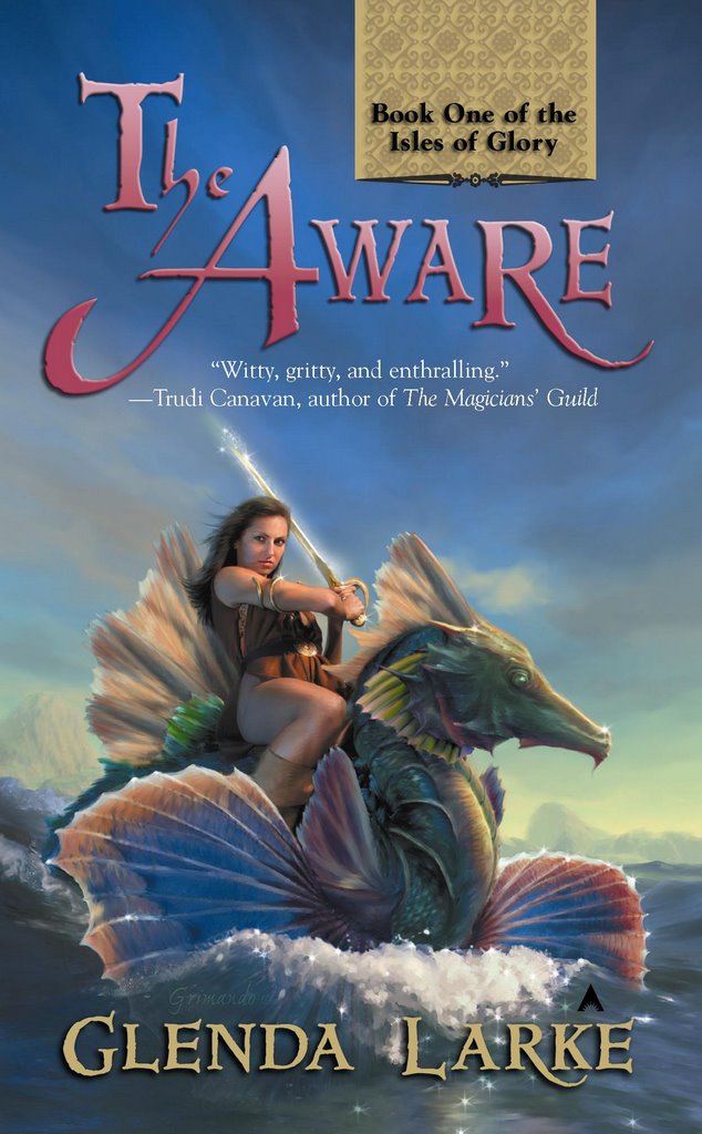
 The whole business of what attracts is a total mystery to me, especially when it is compounded by cultural differences between countries. Here are the covers to The Isles of Glory trilogy. One set is Australian and one set is American.
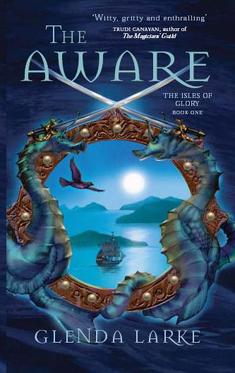
As an Australian when I look at the American covers – and this is a personal observation, not a criticism – I think they don’t represent my books very well. However, I know nothing about marketing, and have to believe that my publishers do. 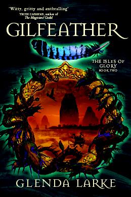 They know what sells and why. The American covers are done by a very talented fantasy artist, Scott Grimando, and I certainly have no complaints about his skills, yet I can’t help but feel they suggest a raunchy book, which it is not. Does it suggest that to American readers too? I’d love to know.
And I like to think my fantasy books are more than swords & scorcery action novels – although there is plenty of that too. To me, the Australian covers suggest that world beyond the action, the other story I have tried to tell about power and people and belief and love and mystery. By use of the ‘porthole’ effect, they cleverly give a hint of an important aspect of the books – the fact that outsiders come to observe the people of the islands.
They were done by one of Australia’s top fantasy artists, Greg Bridges. The third cover can be seen on my website. (I’ll try and get a copy that I can post here later.)
Don’t see no raunch – just see a woman warrior.
To me that suggests struggle, honour and bright courage.
Glenda, the geese are arrowing north here, crying at the heels of the ice dragon.
I saw a flock this morning.
It lifted my heart.
Hmmm. I do see your point. But it doesn’t seem overtly raunchy. Not like a Boris Vallejo cover with the compulsory Dolly Parton breasts and chain-mail thong.
I’m a marketing guy by day, and what they’ll probably tell you is that they are “populating the cover”—or some term similar. People respond to imagery of people. Travel magazines sell more by putting “people on a beach” than showing images of pristine shorelines, sans happy people.
I’d lie and tell people that I’m the actual model for the woman warrior photos.
But, I’m shameless that way.
Lol, M.G.!!
I'm from aussie and find the covers with the designs, instead of with the "woman warrior" more appealing.
This may be because I associate pictures of women on covers of books with cliche unoriginal YA fiction instead of interesting fantasy… But w/e.