
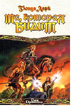
I have just seen the Russian cover of The Aware.
To appreciate this, you should know that when I was mulling over the idea for this trilogy, I made a very deliberate decision not to write books set in a medieval-type world, or in one filled with druids and Celtic or Arthurian-style heroes.
I love worldbuilding, and I hope it shows. (I’ve wondered if that is one reason why Havenstar is so popular.)
I like to describe the world of The Isles of Glory as somewhere between Captain Cook at Botany Bay (1770s) and the Voyage of the Beagle (1830s), and the first book, The Aware, is set on an island that is no more than a sub-tropical sand spit with one main port and not much else. No horses on this sand spit. No dragons either. See if you can separate the guys from the, um, ladies….
By the way, the other two books have very different settings again – but no Eurocentric cities anywhere. If you like your fantasy settings to be stone castles ruled by a king in armour with young princes learning to joust, this may not be the series for you. But I do have mangroves and bird stacks and carved cliffs and strange lakes and British Colonial-type towns and less than salubrious ports and tidal races and…well, go buy the books and read.
I doubt the readers will be disappointed, regardless of the cover.
I know this is probably sacrilege, but even with the – er – discrepancies, I still prefer the Russian covers to the US ones.
Shoot me now. *g*
Lol!!
Well, covers aren’t about what’s inside the covers, are they? They are just there to stop the pages falling out.
And, we hope, to sell the book.
Yeah hmm.. don’t you wonder what your name sounds like in Russian ? 🙂