Yep, that’s right, as of tomorrow in the UK, Stormlord Rising is available in book stores!
It’s been bouncing around nicely on Amazon for a couple of days, breaking the 1,000 mark on the best seller list, which is lovely to know. And of course, I am an utter wimp for even looking…
(Just try to stop me…)

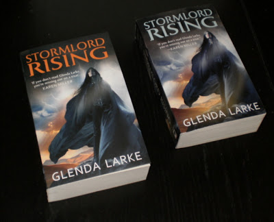
ON the left UK, on the right US.
On the left, matte and slightly hazed, sort of glowy, on the right, shiny and sharper.
On the left more orangy, on the right more blue.
On the left more orangy, on the right more blue.
Which do you prefer?
.

I almost never say this… but I think I actually like the US one more.
Wonders will never cease.
in this instance only, the US cover. The orange writing on the UK cover gives a shortened effect on the picture, whereas the blue writing looks as if the words are appearing in the sky, therefore part of the main picture.
Wot they sed:-)
I guess I go for bright and glossy. I like the UK one better.
Actually, I like the Aussie one better than either.
I rather like the orange title…stands out more, I think. But I love them both.
I like the UK version.