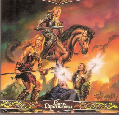
 The Russian cover is soooo unpopular on the poll, I thought I’d blow up the pix so you can have a better look.
Given that I wrote a book – in fact a whole trilogy – that never had a single horse in it anywhere, don’t you just love this? Of course I never had pterodactyls, or strange land beasts either. And Blaze wouldn’t be caught dead in an outfit like that. Still, it’s not all that bad is it??

It is a good picece of graphic design which is mostly unrelated to the book.
I guess you have to trust the publisher/designer/artist of the country of publication to know what catches the eye sells books.
yeah I can just imagine Blaze responding to someone's suggestion that she wear that! Run for cover!
But I have questioned for years, do the artists ever actually read the books? I am sure it would help.
It's a real delight when you find a book cover where the artist has used the story as a guide but obviously not here. I do wonder if publishers anywhere care. I suspect they have ideas of what they think the readers would like, hence the outfits on this cover. It might improve their sales if they worked out what the actual readership is.
There was a British comedy series running in which the main male character had written a book called "My Life in Africa" which was supposed to be a very boring book, but the publisher wanted a cover showing the author in hunting gear with a rifle and his foot on a dead animal with a "beauty" on supplicating on her knees. That way he said it would sell LOL. Basically it seems publishers do what the hell they like with covers.
I have not read this book yet. But, I was wondering if it had anything to do with the book itself. I see here that it kind of doesn't. It is a cool looking cover blown up though. Thanks!